A brand logo is a core element of visual identity and a key factor in shaping first impressions. However, many businesses in the Libyan market misuse their logos in ways that weaken brand recognition and reduce perceived professionalism.
Key common mistakes include:
Lack of brand guidelines
Using different colors, sizes, or versions of the logo due to the absence of a clear brand identity manual.
Improper logo modifications
Stretching, compressing, or adding visual effects—frequently seen on signage and printed materials.
Poor color and background choices
Especially in outdoor advertising, where lighting conditions and environmental factors affect visibility.
Insufficient contrast and readability
Placing the logo on busy or unsuitable backgrounds, making it hard to recognize.
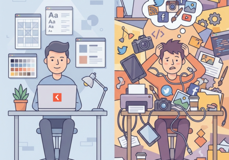
Inconsistent use across platforms
Different logo versions on social media, storefronts, and official materials confuse the audience.
Low-quality logo files
Relying on screenshots or raster images instead of proper vector files.
Ignoring local cultural context
Failing to consider Libyan cultural norms and visual preferences can negatively impact brand perception.
Conclusion:
Correct logo usage is not merely a design detail—it is a strategic branding decision. In the Libyan market, consistency, clarity, and cultural awareness are essential for building a strong, credible, and sustainable brand identity.